The challenge
Systemizy does a lot: it generates components, organises tokens and exports the result to Figma. A feature list would not make that land.
The team needed a site that shows the product working within the first screen and still has room for pricing, docs and a status page.
What we did
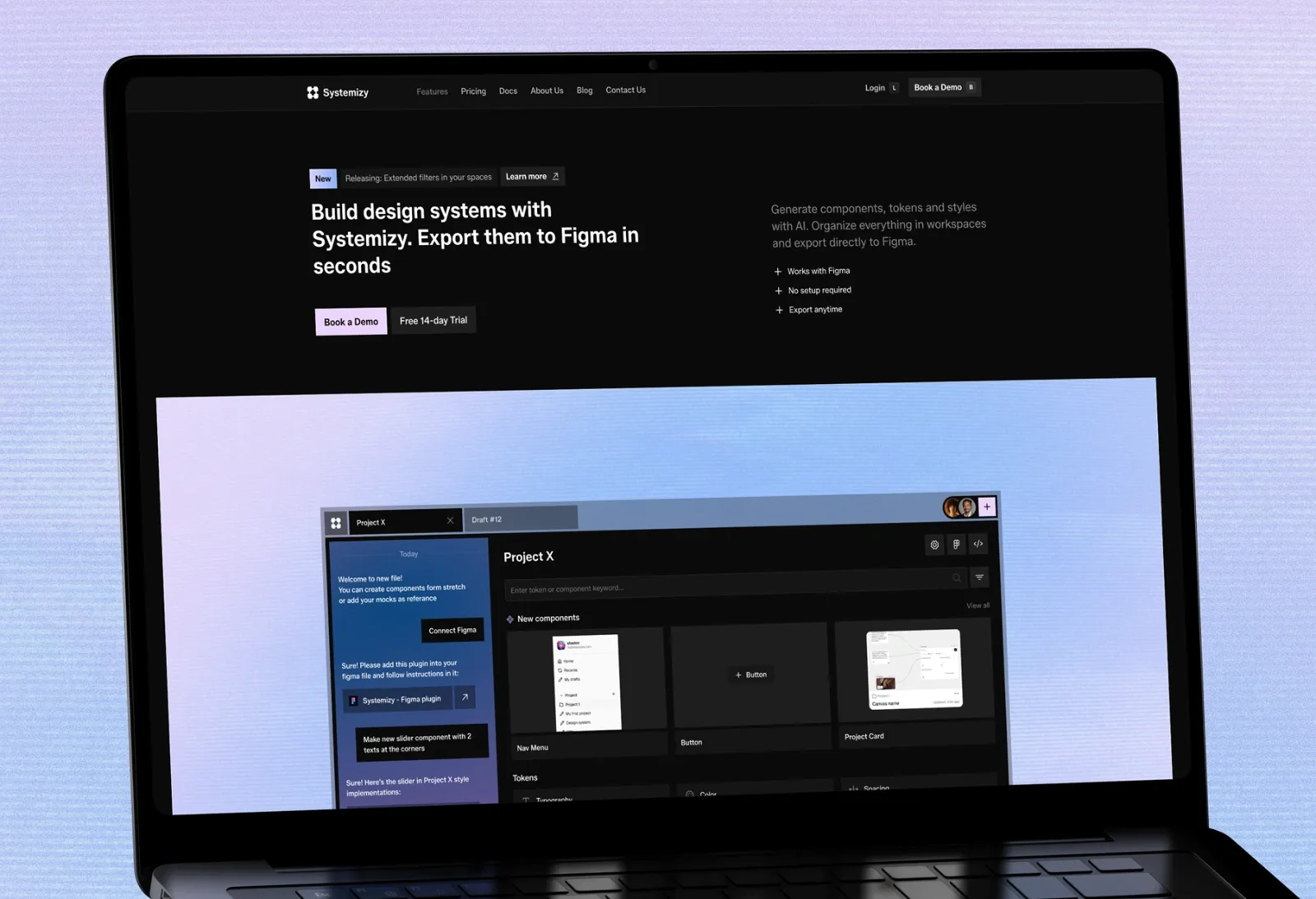
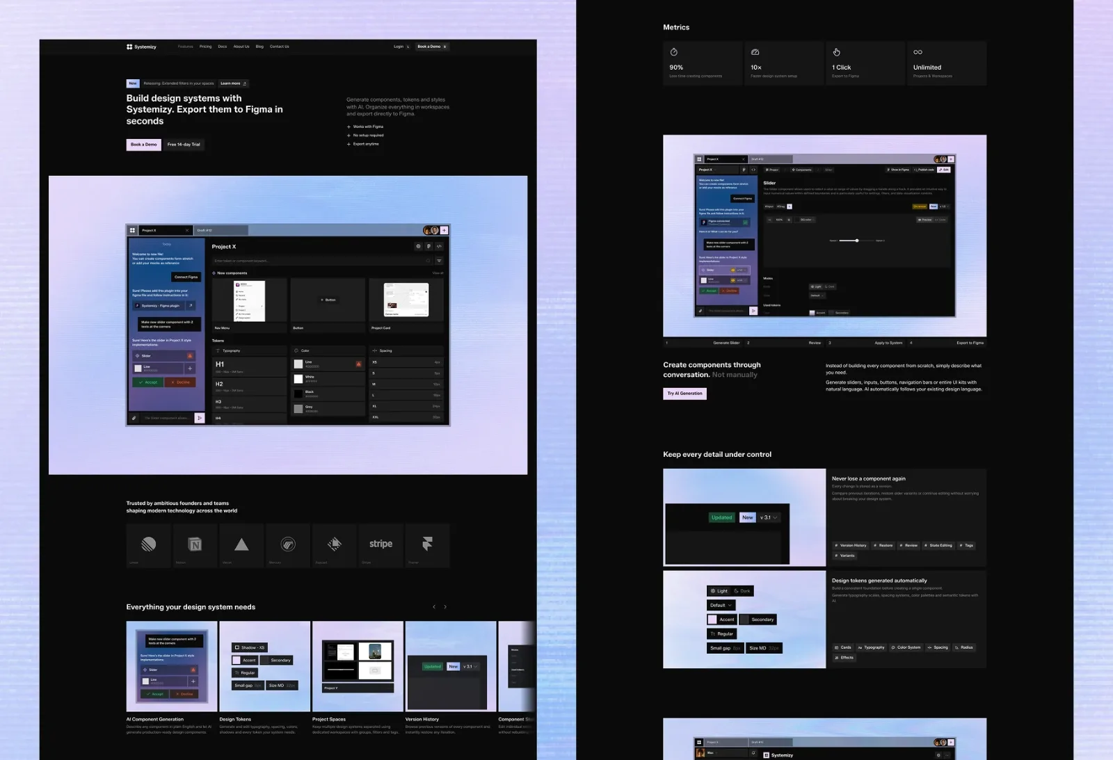
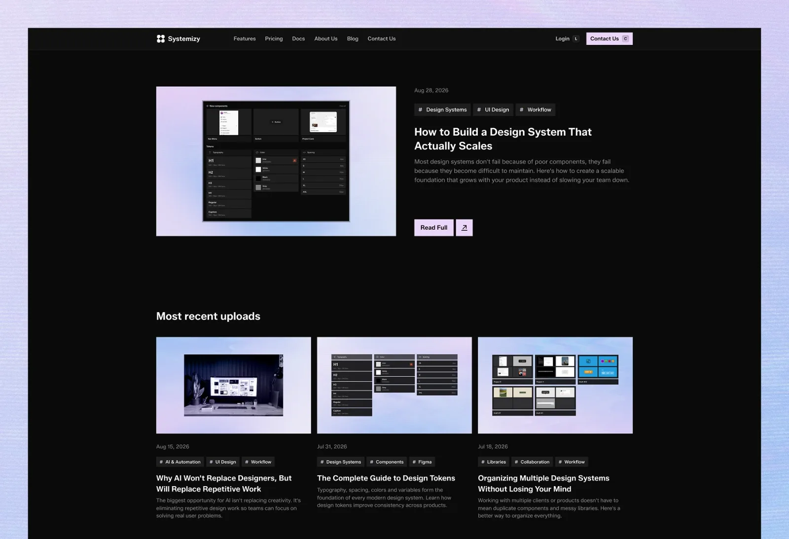
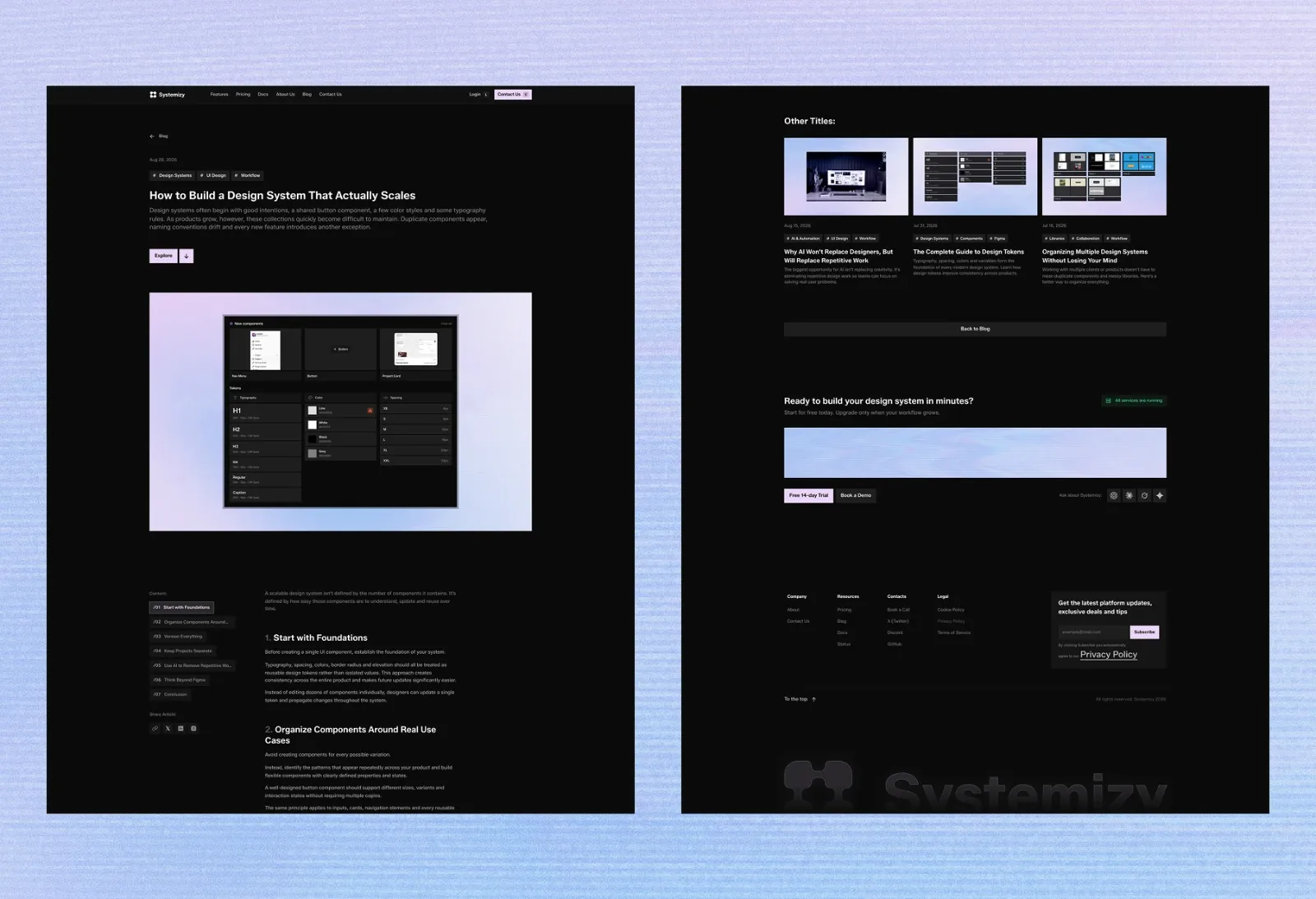
The hero is a full product screenshot on a soft lavender gradient. Every section after it is a real view of the interface doing one job.
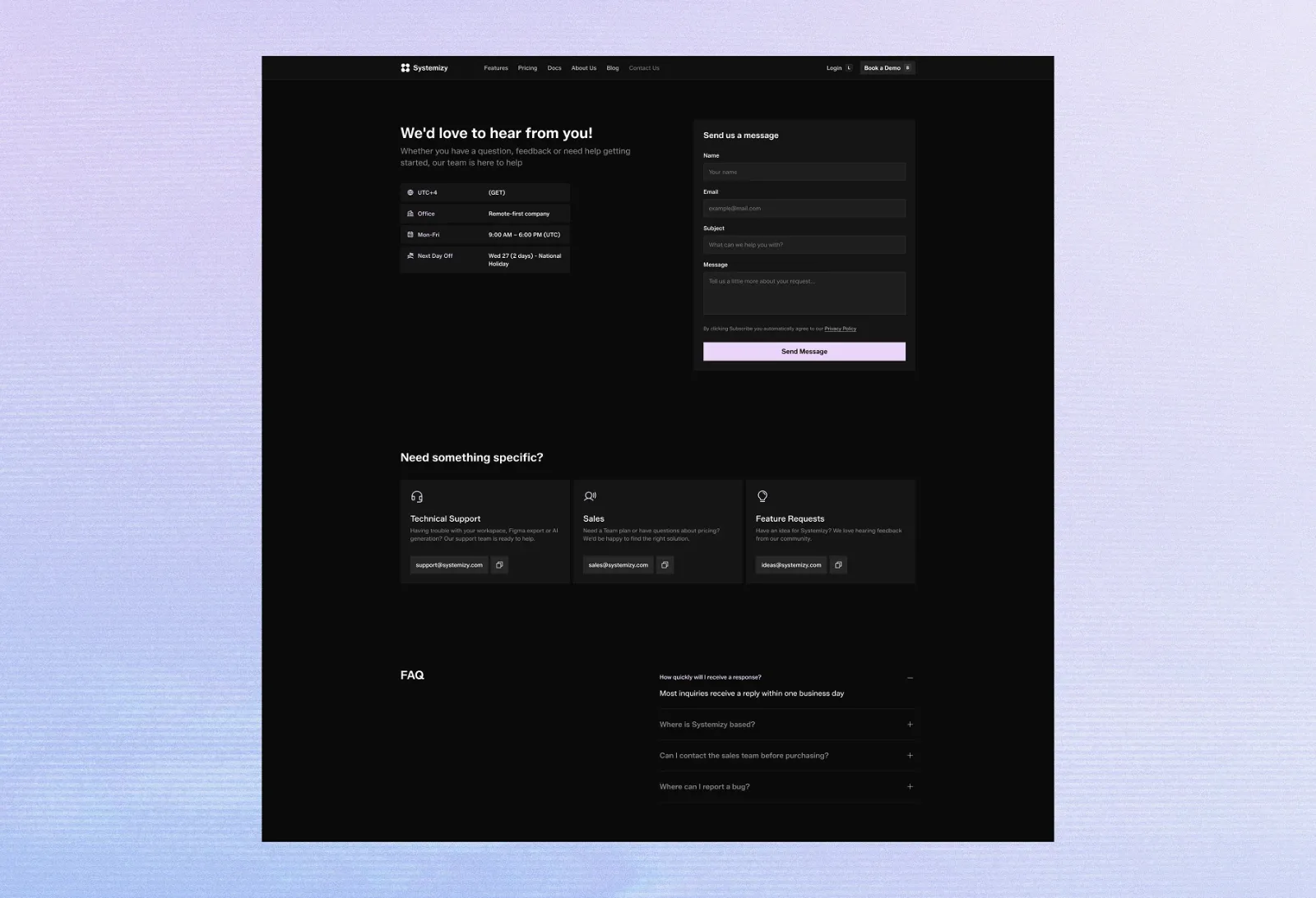
A dark, product-first layout keeps attention on the screens. The gradient returns only where an action is expected.
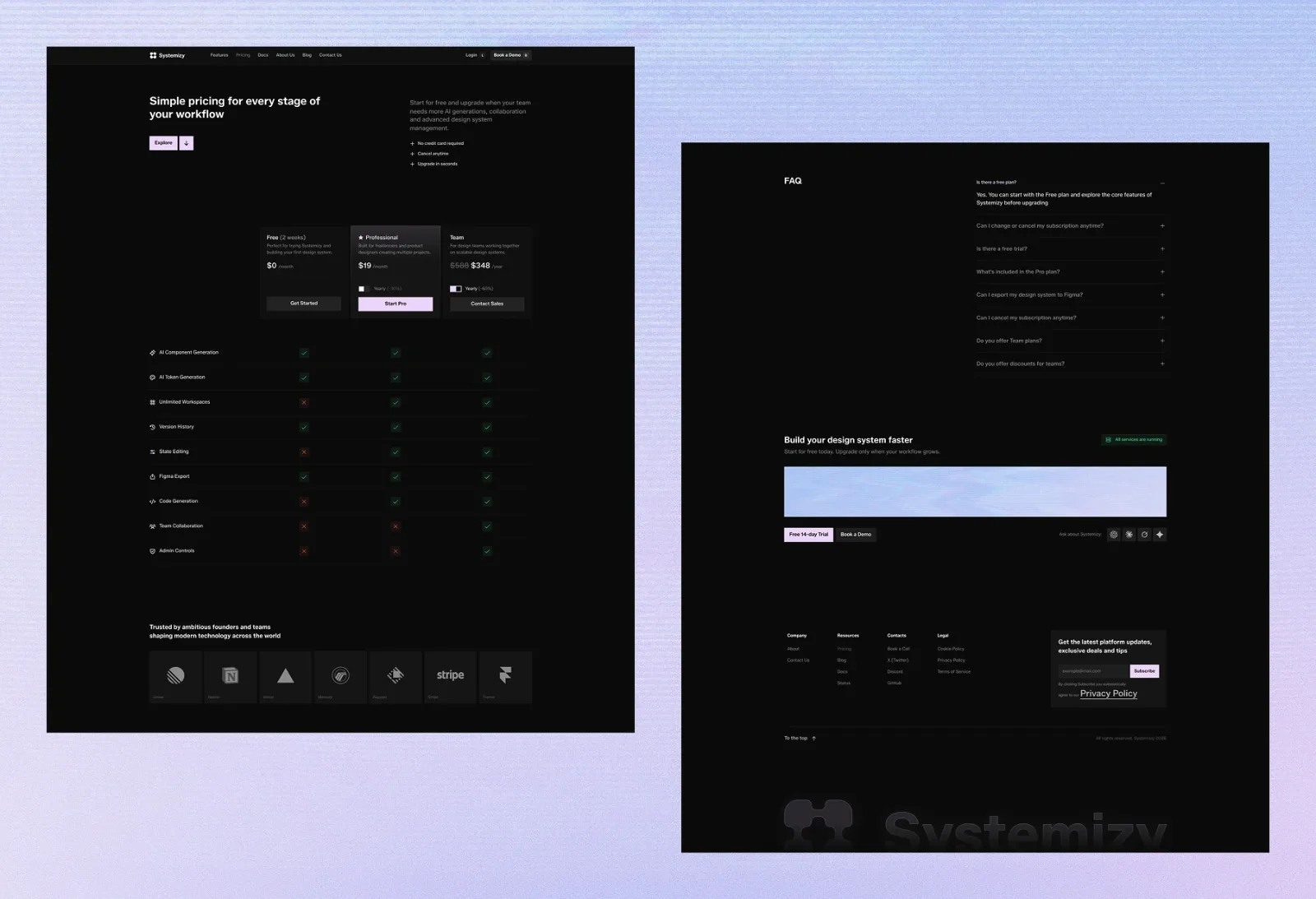
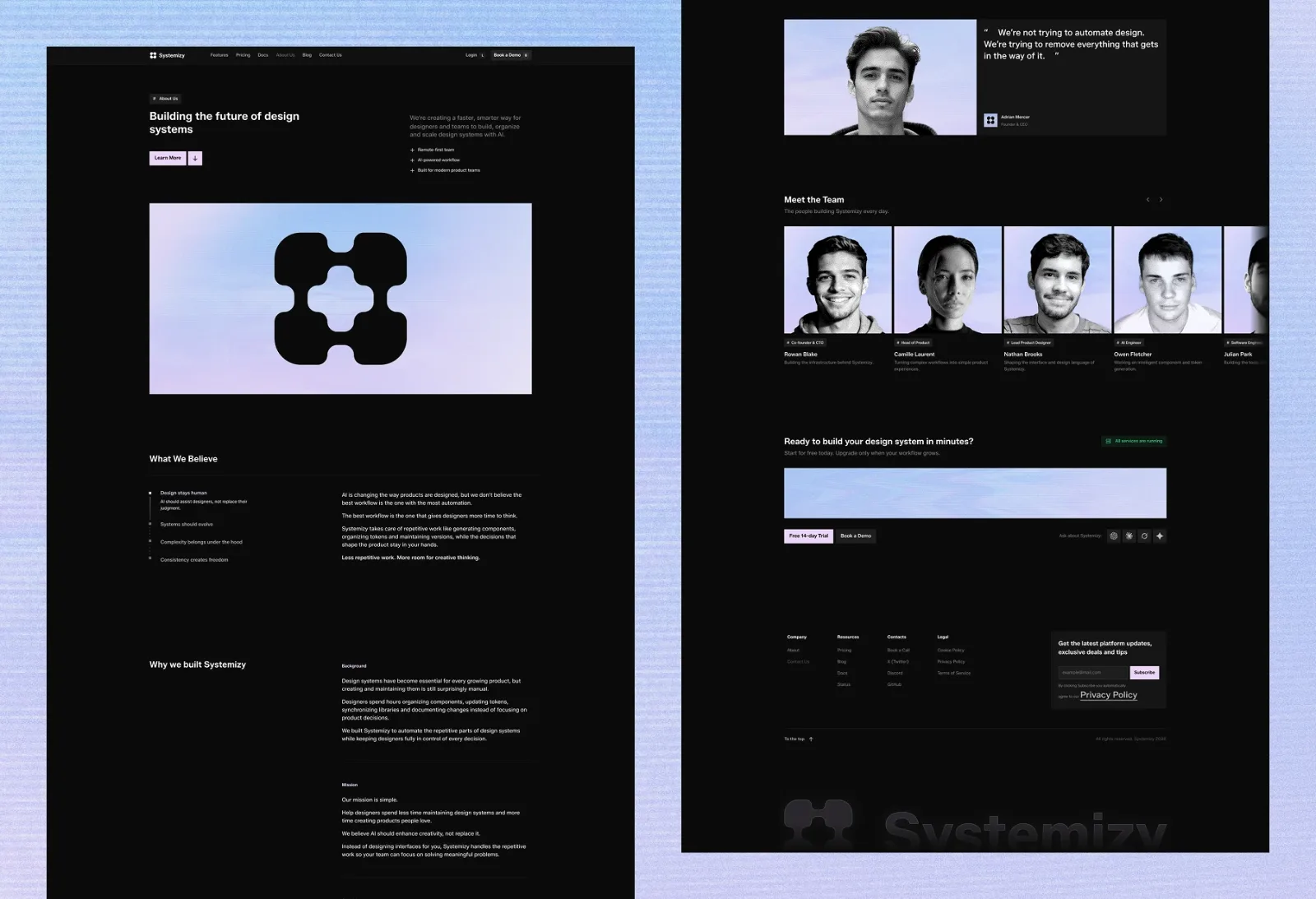
Pricing, docs, status and sign-up use the same components as the homepage, so the whole site feels like one product.
Where it stands
A fourteen-page marketing site that explains the product in one scroll and gives the team a system they extend themselves.